• Home
  • Work
  • About
  • Contact
Kristin McCleerey
  • Home
  • Work
  • About
  • Contact

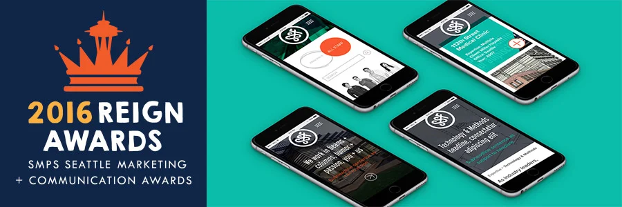
SSF named "Best Website 2016" at the Seattle Reign Awards!

"SMPS Seattle’s annual Reign Awards gala recognizes excellence in marketing communications and outstanding achievements of top marketing professionals."

Working on the SSF website was a highlight at Dapper this last year. As the Senior Designer on the web, branding and print project, I was thrilled to collaborate with the enthusiastic, design-centric team at SSF. There were no limitations on where we could take it, creativity boarderlining ridiculousness outpoured from each individual in the room, and we landed in a place that represented them perfectly. Their team is talented, and their personalities would make SSF an incredible place to work. 

We drew on their culture in the photography styling, unique responsive and HTML5 layouts, bold colors and hierarchy in type. Every word and graphic detail was thoughtfully considered. 

A similar engineering group on the East coast contacted SSF after launch expressing that the SSF site was everything they had been wanting to convey to their web team. I believe the exact quote was: "I want your website man." We couldn't feel better about that response. Websites are powerful tools to make your business stand out from the rest. Does yours? 

Big congrats to the team at SSF for all of their hard work! It pays to collaborate. 

For more information on the Reign Awards, click here.

To see the SSF project page, click here. For their website, click here. 

tags: K Brand Studio, web design, print design, awards, reign awards, SSF, branding, Dapper
Wednesday 06.15.16
Posted by Kristin McCleerey
 

Design For Success: How To Choose The Right Visual Elements To Define Your Brand

If you need proof that customers have strong feelings about the simplest visual branding symbols, let Exhibit A be a solid blue box behind three white letters.

When retail apparel giant Gap decided to tinker with its famous logo in 2010, the backlash was immediate—and fierce.

“Their customers had a fit,” said entrepreneurial branding coach Rochelle Valsaint. As a marketing consultant in the Atlanta office of concierge service provider LesConcierges, Inc., Valsaint is an expert on small business branding. She cited Gap’s logo debacle as an example of what can happen when visual branding goes wrong.

Consumers and design critics alike disliked the new Helvetica typeface and mocked the shrunken blue square that had been stuck in a corner like an afterthought. A week later, the old logo was back, and Gap had learned an important lesson about how branding impacts perception.

While the change was intended to give the Gap logo a more contemporary look in keeping with store’s evolving clothing line, customers saw instability in the abandonment of a familiar classic design.

What’s your story?

Whether you’re launching a new business, working with a new agency, or just contemplating a re-design, the first step is deciding what message your graphic content should convey. Your brand needs to tell a story—and that story begins with the most important part of your visual brand: your logo.

“People will see your logo before they read anything about you,” said Valsaint. “It’s the first thing that speaks to someone about who you are as a company.”

Employing familiar symbols in your logo design can help you connect quickly with an audience that’s overwhelmed by millions of competing messages, said Maggie Macnab, a Santa Fe-based graphic designer and author of Design by Nature.

“Find a general concept that’s familiar to most people in the world—that’s the symbolic element—but find a way to integrate something into it that is unique about your business,” Macnab suggested.

Early in her career, an Albuquerque veterinarian hired Macnab to design a logo for his dog and cat practice. She first thought of using a paw print as a universal symbol, but that image alone was too generic to convey the nature of the vet’s business. Then she remembered a scene from the classic fable “Androcles and the Lion,” in which a man pulls a thorn from a lion’s paw to relieve its pain. That gave her the idea to put a bandage on the paw. The resulting logo instantly conveyed the idea of caring for small animals and earned Macnab a national ADDY award from the American Advertising Federation.

Turn ideas into results

Here are three tips for working with a graphic designer or marketing consultant to create a successful visual brand:

  1. Use Pinterest to collect images you like into a vision board, and show it to your designer for inspiration, Valsaint recommended.
  2. Don’t let your own design biases get in the way. Elizabeth Kraus, author of 365 Days of Marketing, writes that by being aware that your preferences are neither right nor wrong, “you can become open to a more objective, analytical brand analysis that should result in a better outcome for your business.”
  3. Share some relevant materials with the designer. White papers, client proposals, press reports and other written material can add layers of “tone and depth” to a designer’s understanding of your company’s identity, Valsaint said.

Your company logo doesn’t have to win awards in order to be effective, but it does need to win your customers’ approval, so keep your customers at the forefront of your design plans. Consider holding informal focus groups or conducting polls. Dig into any intelligence you may have about your customers’ preferences and behavior. It doesn’t matter how you get the information—but it will matter if you don’t.

Source: Forbes; Author: Sonya Stinson; URL: http://www.forbes.com/sites/sage/2014/06/30/design-for-success-how-to-choose-the-right-visual-elements-to-define-your-brand/

tags: Branding, Logo, Forbes
Tuesday 11.03.15
Posted by Kristin McCleerey
 

A Little Business Introspection Goes A Long Way In Design

biz_introspection_banner.jpg

You've just met someone new at a restaurant or gathering and the inevitable question arises—"What do you do for a living?" 

How do you answer? Do you keep it short and sweet, overemphasize technical terms to look smart, or do you have a crafted response that truly does sum it up perfectly? 

I want all three. 

Why? Because I want my work to be as informed as possible and not just by one person. Give me the technical bit! Spell it out in 10 words or less. Just as there are layers in a business description, there are layers within a brand that represents a business. These should go hand-in-hand. 

I also want to know what your day looks like. I want to see your space, meet your people and understand your processes as if I'm a part of your business. In fact, I'm often times looked at as an out-of-house in-house Designer. I get calls to do small labels for event giveaway packaging, as well as entire rebrands covering web, print and environmental graphics. Project size isn't a question with me. I'll understand your business and can cater my process to your processes and you don't need to re-explain all that you do. You can trust that I know what each project needs to reflect. 

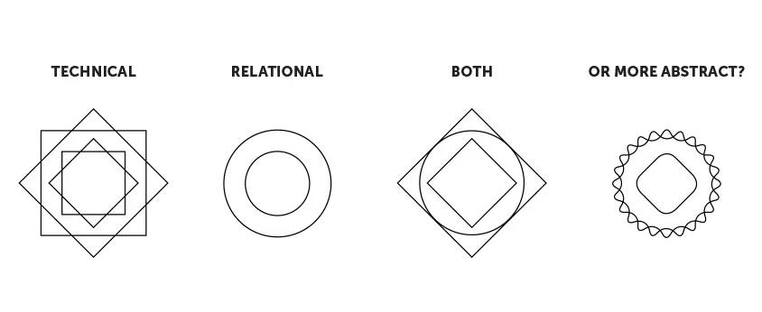
Even lines and edges can reflect something about what you do. Is your business:

Does this deep dive need to take a lot of time and effort from your team? Absolutely not. 

What do I ask of you so that you get the most out of me? Some business introspection. I'll go through some questions with your team and create a Brand Platform document that outlines tone of voice, target audiences, directed messaging, do's and don'ts, your brand personality, and more. It's your go-to foundation for your marketing. It keeps everything as consistent as possible, which is incredibly important in maintaining a strong brand. 

Through this introspection, you may discover changes that you want to make within your business. What's working and what's not working? How can your new brand or brand applications reflect that? 

More is more when it comes to information. Let's not just make things look good, let's give them meaning. I'd love to know more about what you do for a living. 


tags: branding, design process, business introspection, deep dive, K Brand Studio
categories: Deep Dive, Branding
Monday 11.02.15
Posted by Kristin McCleerey
 

WORK   //   ABOUT   //   CONTACT